Times Privilege
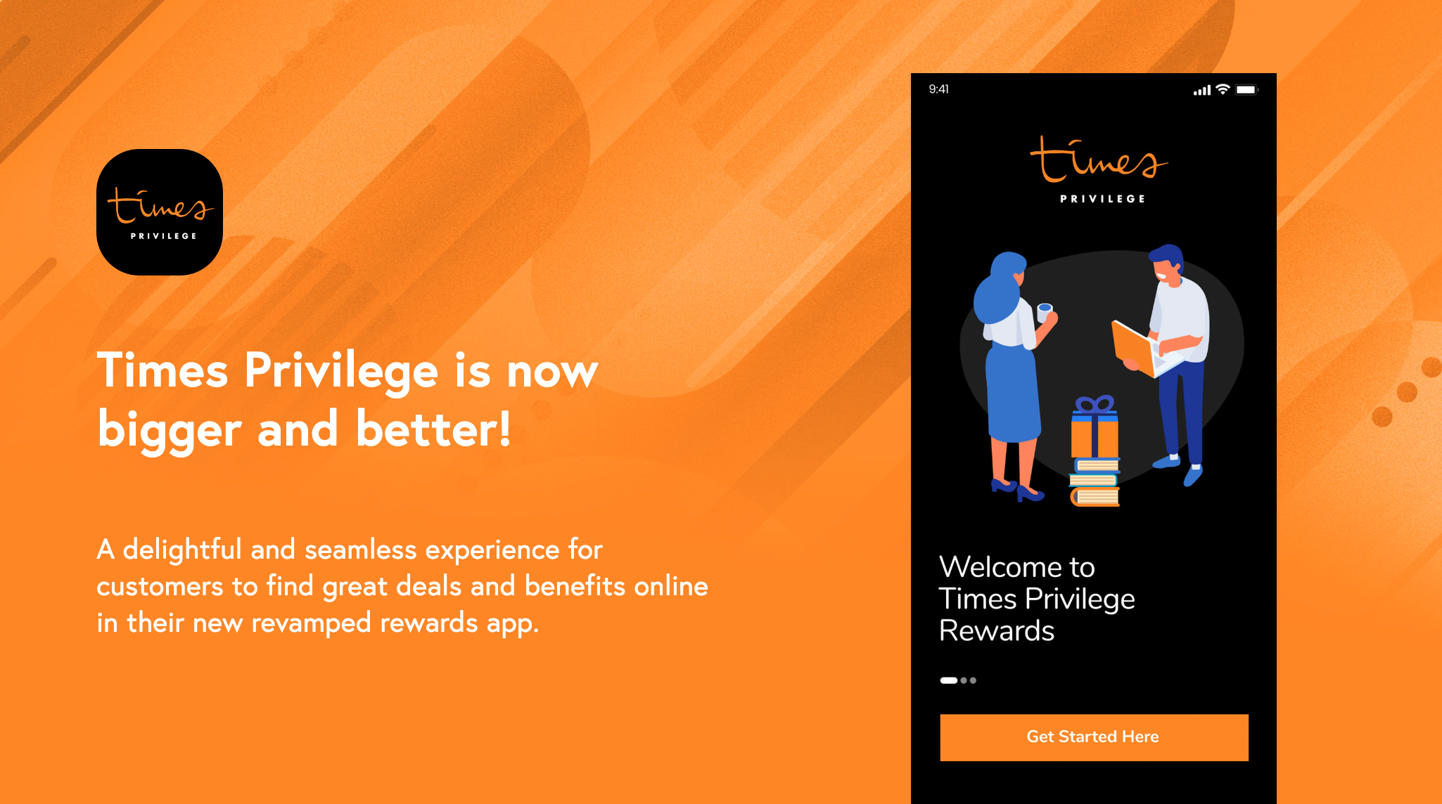
The Local Times bookstore offers its very own loyalty app, allowing customers to both spend and earn rewards.
My role
UI/UX/Web DesignerWhat I did
The Challenge 🚀
Redesign an existing loyalty program's user experience to boost customer engagement. This involves simplifying the process, enhancing transparency, and personalizing the experience to address user needs and preferences effectively.
Identifying user needs and priorities
We initiated our preliminary research by interviewing users to pinpoint common pain points. Engaging with stakeholders from Times Bookstore enabled us to grasp users' typical app interactions and their priorities.
Drawing from feedback and reviews, we identified several common issues:
Users have expressed dissatisfaction with the user interface, noting that it lacks both intuitiveness and visual appeal. Specifically, they have difficulty locating key features such as the scanning function to earn rewards and the reward tracker. These functionalities, which are crucial for their interaction with the platform, are not prominently displayed or easily accessible within the interface, leading to frustration and diminished user experience.
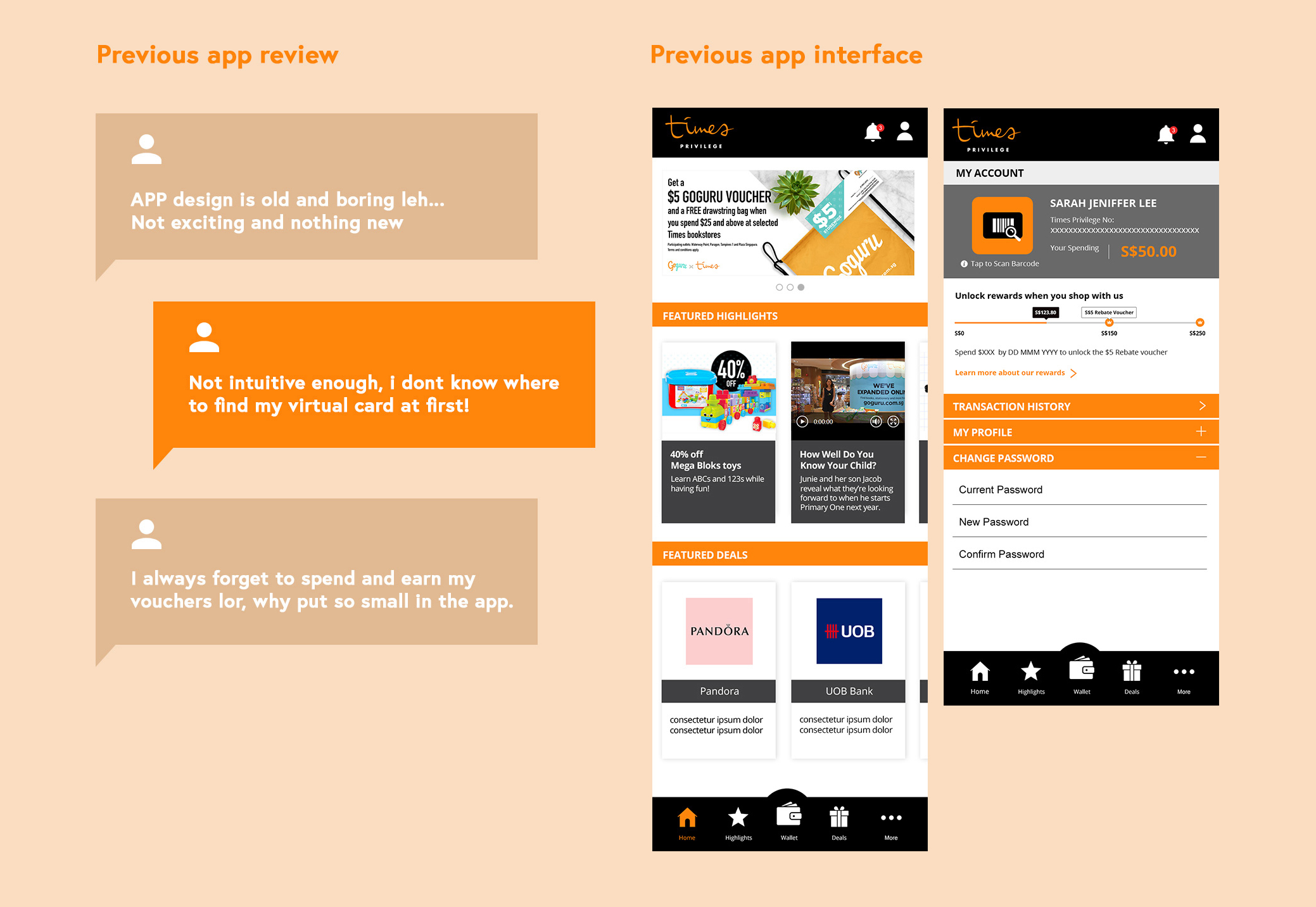
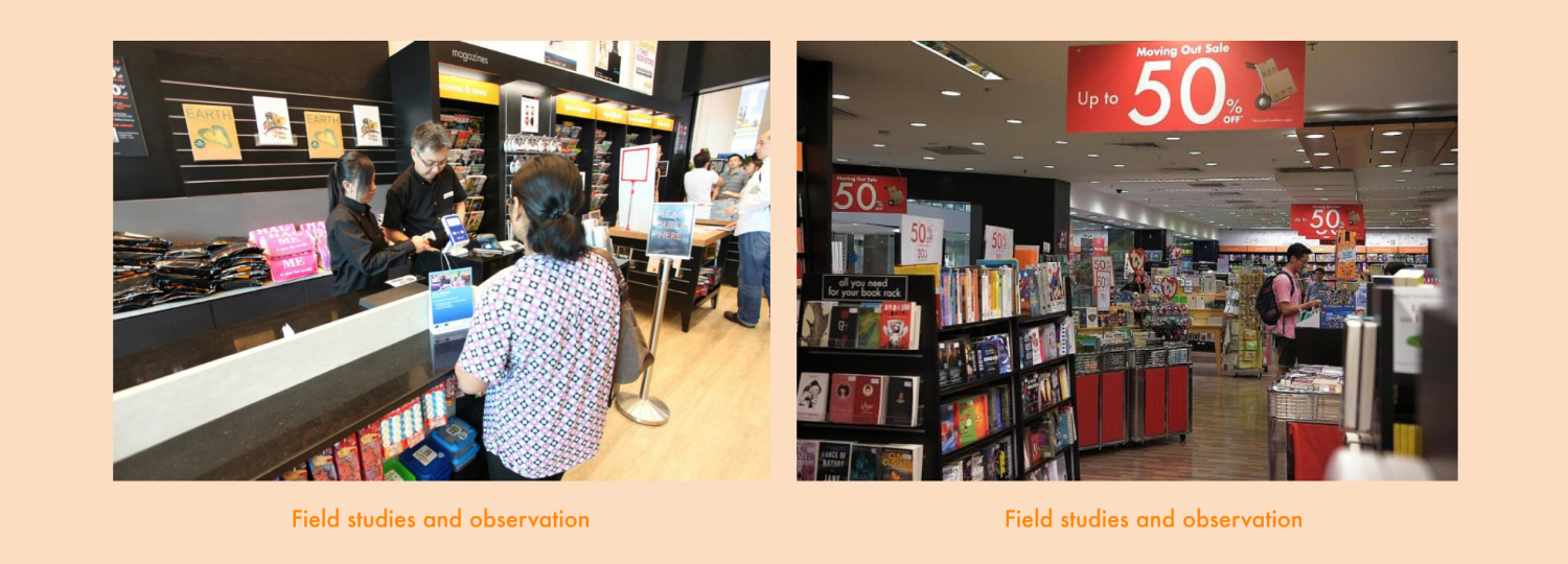
To comprehensively address the identified issues, we conducted in-depth contextual observations and user research, dividing users into two distinct segments. Through this process, we gained valuable insights into their behaviors, preferences, and pain points. Subsequently, we crafted detailed user journeys and personas for each segment, providing a deep understanding of their unique needs and challenges. These insights empowered us to tailor our design solutions to better meet the specific requirements of each user group.
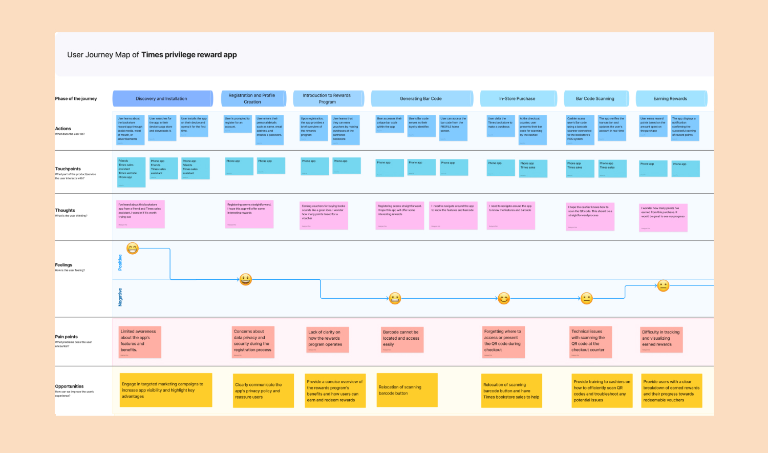
Understanding Customer Jobs: Segmenting and Persona Creation / User Journey Map / User Stories
To grasp our customer base better, we split them into two groups based on the tasks they need to complete. For each group, we made detailed personas focusing on the main jobs they're trying to get done. This helped us understand what drives them when using our product or service and what challenges they face. By focusing on these core tasks, we could tailor our solutions to better meet their needs.


Furthermore, crafting journey maps enabled us to visualize the user experience from start to finish, identifying key touchpoints and opportunities for improvement.
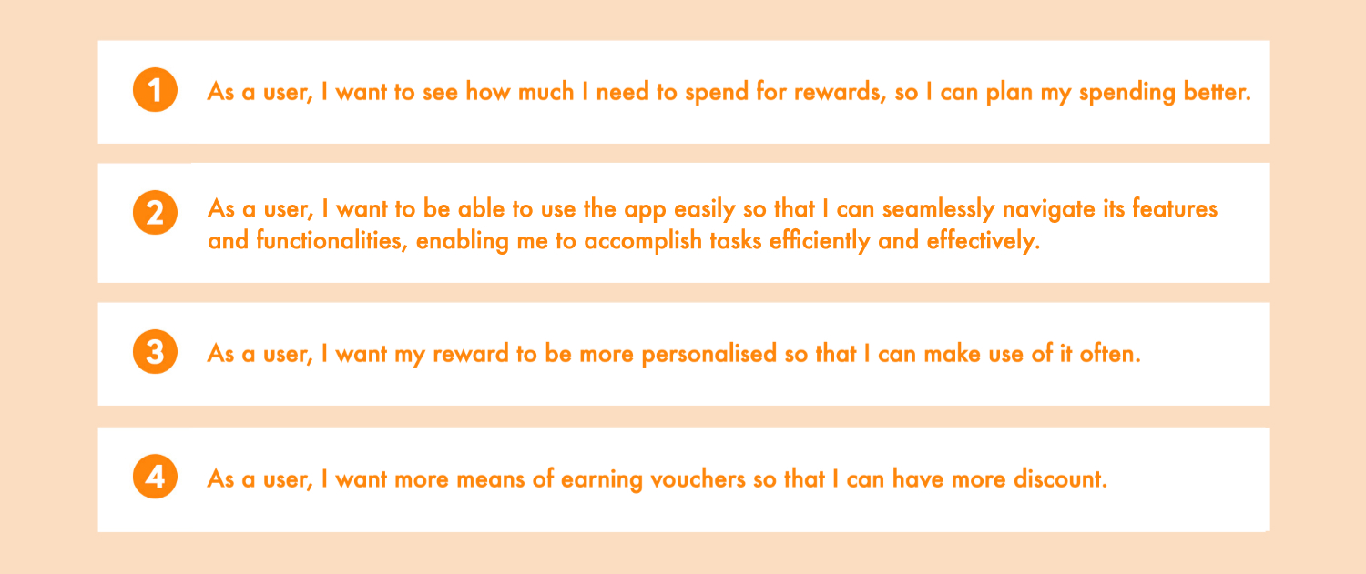
The creation of user stories provided a detailed breakdown of the tasks and actions users undertake to achieve their goals. This granular approach facilitated a more focused and user-centered design process, ensuring that our solutions effectively met the needs and expectations of our target audience.
The Solution
MVP which align with our user findings and business goal:
With insights from our research and discussions with stakeholders, and mindful of time and budget limitations, we've refined several features tailored for our MVP.
❖ Rewards tracker
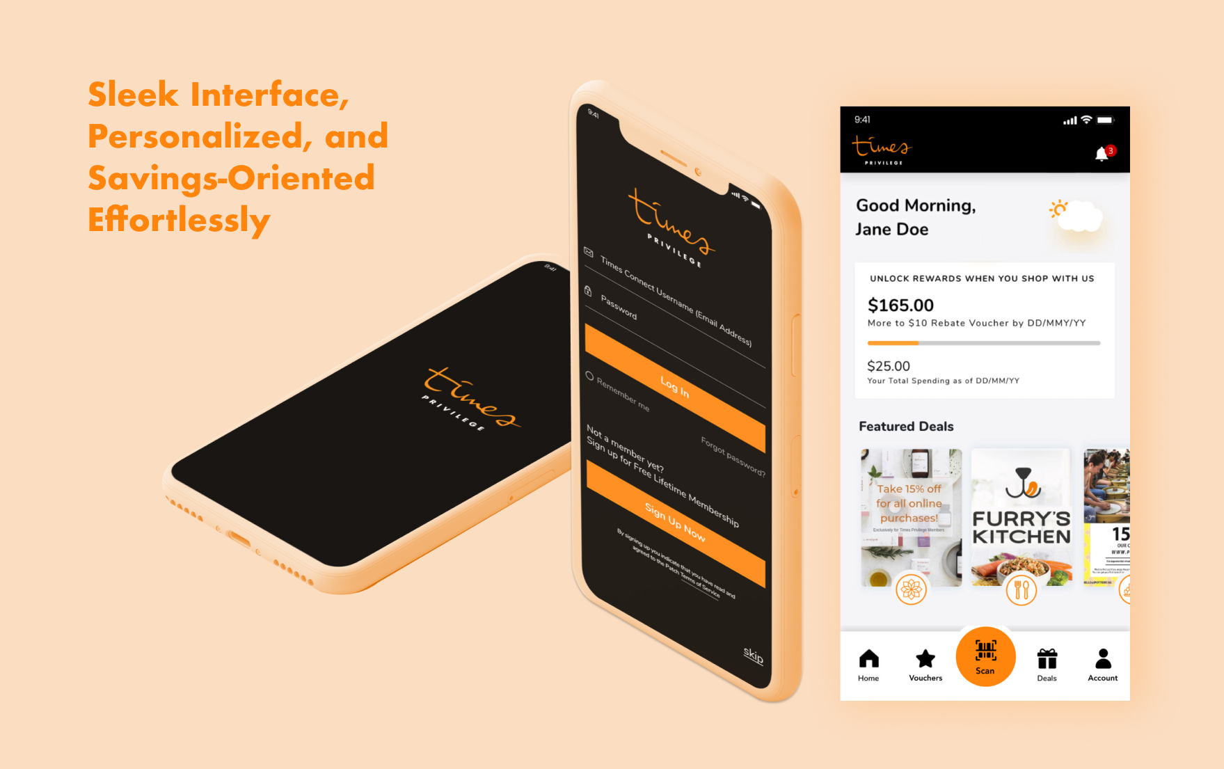
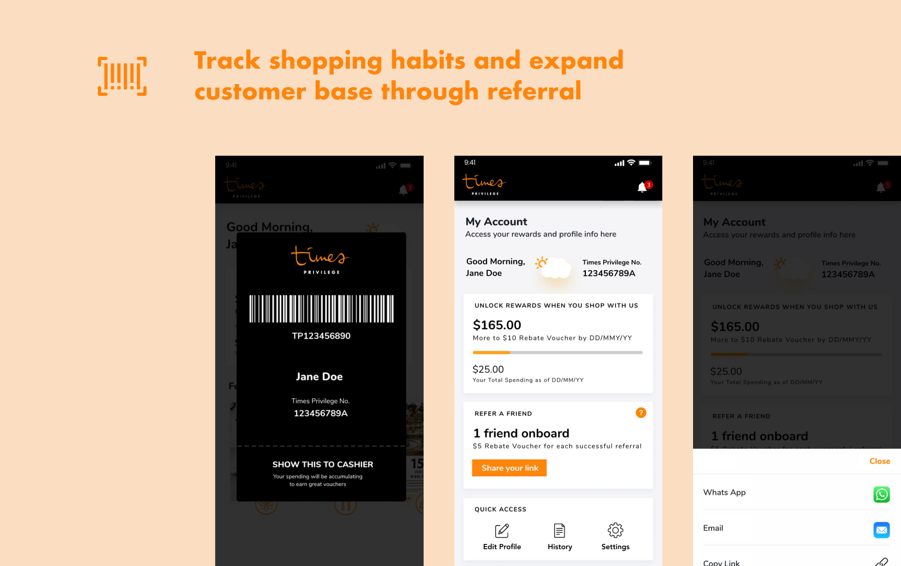
Visualize spending targets on the homepage, showing clear amounts and deadlines pre-reset for effortless monitoring.
❖ User-Friendly UI
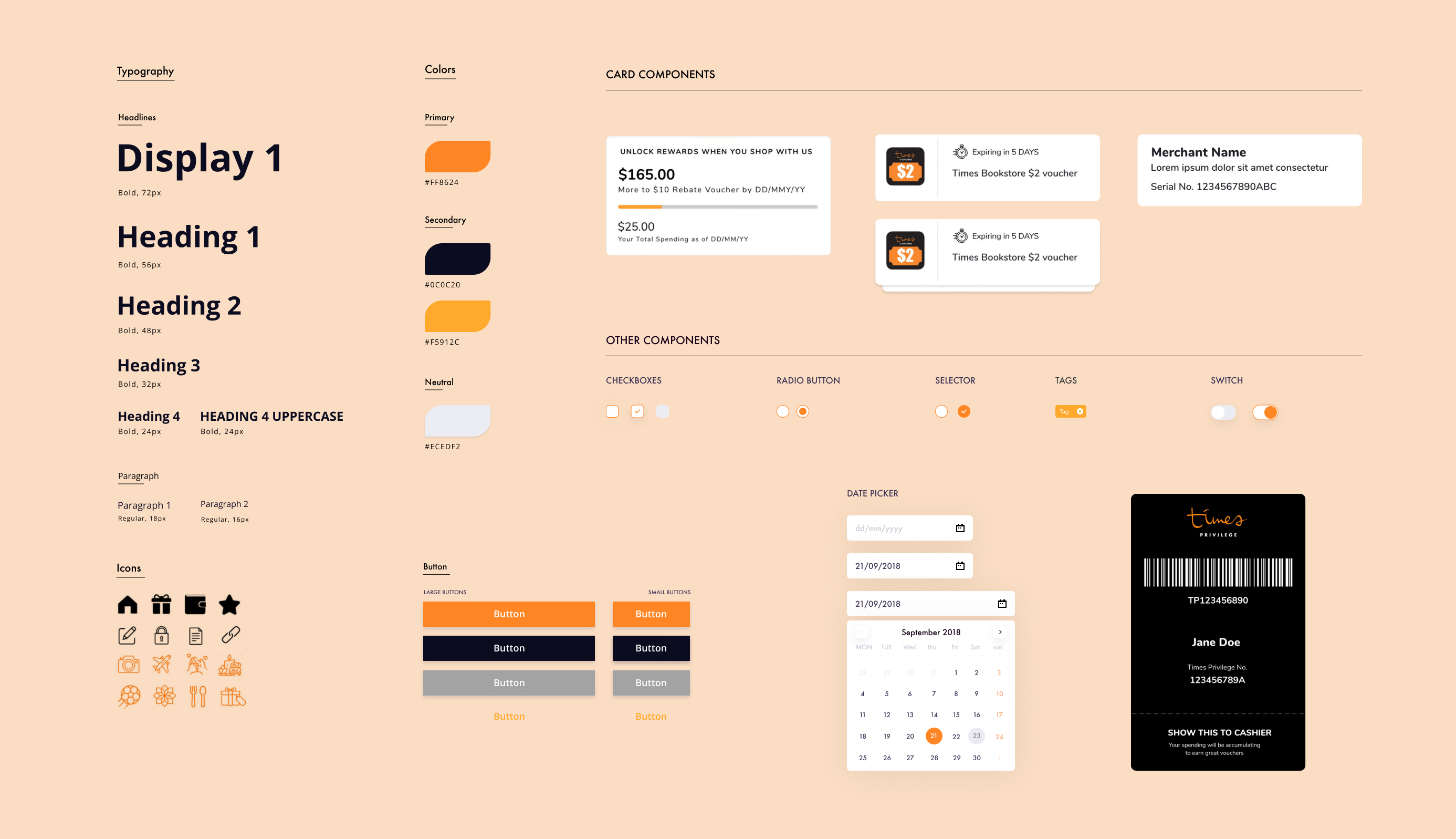
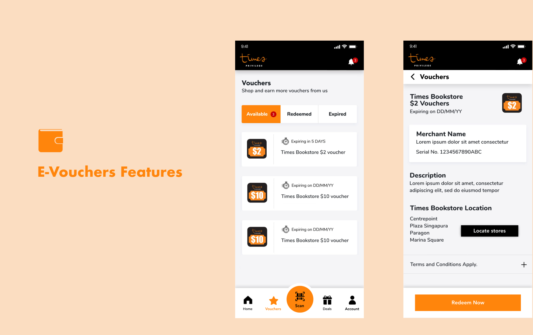
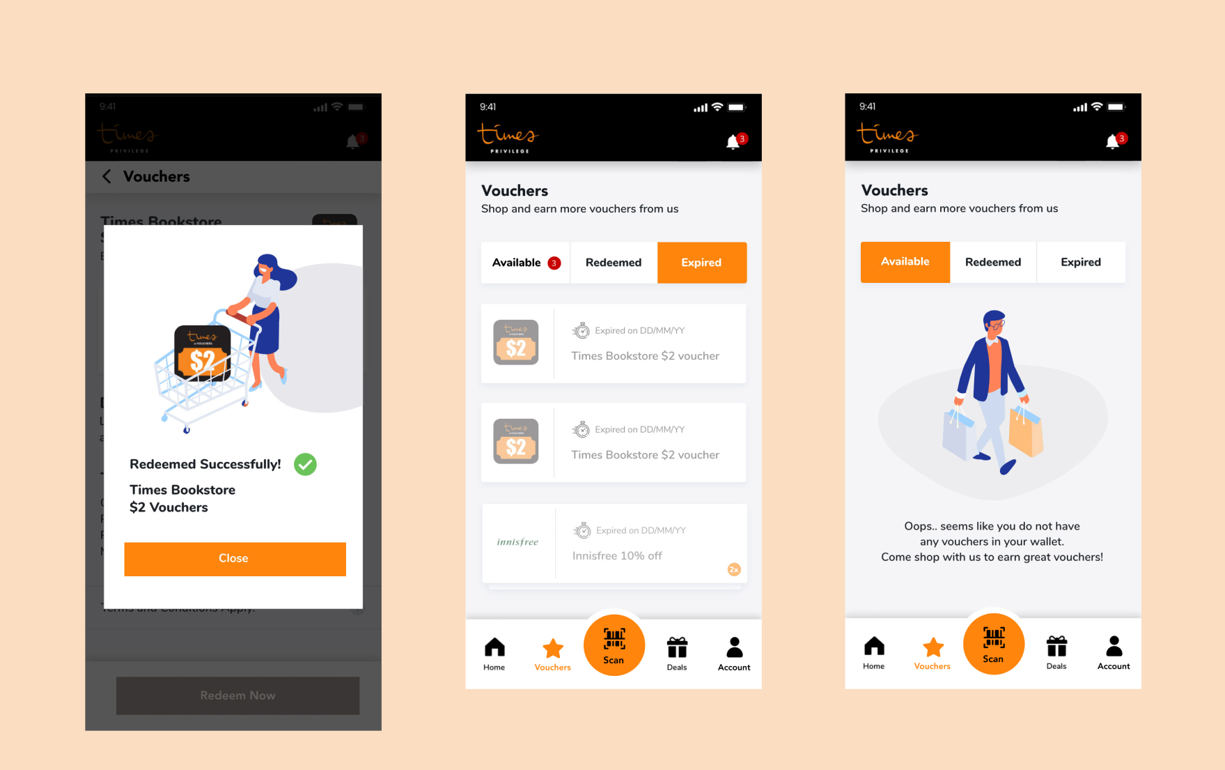
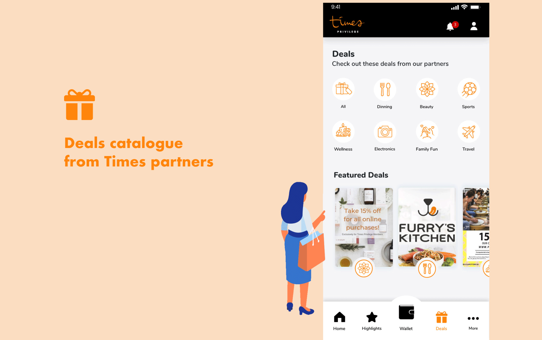
Revamp UI components for improved accessibility, facilitating quick button scanning, effortless deal browsing, and seamless e-voucher management.
❖ Refer a friend
A way to bring in new customers at less cost and keeping their current member base satisfied and happy.
❖ Personalized
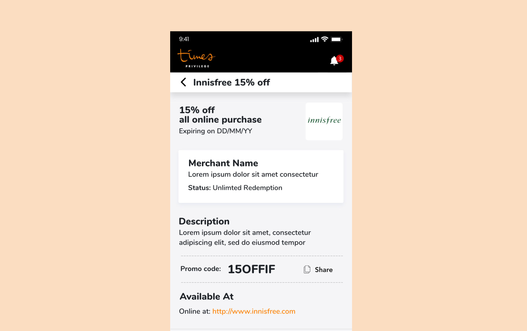
Use purchase behavior tracking for personalized promotions. Collaborate with brands for attractive deals, driving customer sign-ups.
Building our Vision
Wireframing: Early Explorations
During our ideation phase, we explored different possibilities for UI elements and feature placements, assessing their compatibility with our loyalty program mechanics and their ability to address our identified solutions.
A/B Testing, Usability study
We conducted A/B testing with users to validate the design solutions. Additionally, we developed wireframes and performed usability tests to assess users' ability to complete tasks seamlessly.
Prototyping: Refining Designs
Following multiple rounds of internal reviews, we finalized a collection of high-fidelity designs.
Final Designs
Impact / Learnings